Colour
Paladin’s colour palette choices are used to differentiate, create depth, add emphasis, and help organize information.
Hero Colours
Knight's Navy helps convey success, security, confidence while Aegis Gold conveys warmth, courage, and honour. Knight's Navy and Aegis Gold are the main company colours - Iceborne Blue should be used sparingly.
Knight's Navy
- RGB: 0, 38, 62
- Hex: #00263E
- CMYK: 100, 78, 48, 54
- Pantone: PMS 2965C
Aegis Gold
- RGB: 255, 199, 42
- Hex: #FFC72A
- CMYK: 0, 23, 91, 0
- Pantone: PMS 123C
Iceborne Blue
- RGB: 41, 171, 227
- Hex: #29ABE3
- CMYK: 69, 15, 0, 0
- Pantone: PMS 229C
Accent Colours
The tertiary palette is used as a small accent to the hero colours.
Morning Fog
- RGB: 200, 200, 200
- Hex: #C8C8C8
- CMYK: 16, 11, 15, 5
- Pantone: PMS 420C
Abyssal Blue
- RGB: 5, 2, 24
- Hex: #050218
- CMYK: 79, 92, 0, 91
- Pantone: PMS Black 6 C
Titan's Grey
- RGB: 112, 128, 144
- Hex: #708090
- CMYK: 22, 11, 0, 44
- Pantone: PMS 430C
Logo
Logos and branding are an important visual shorthand, representing what Paladin stands for, and the values it embodies both internally and externally.
Logomark
Paladin's logomark features a horse within a diamond. Two colour variations are acceptable: the logomark in Aegis Gold and Knight's Navy.
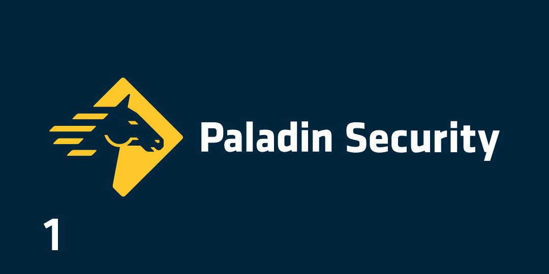
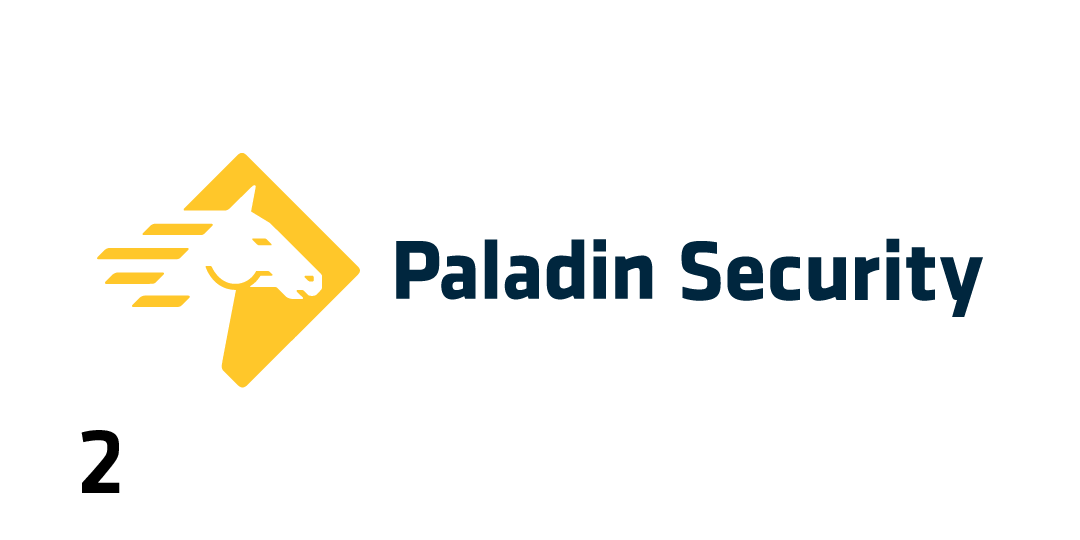
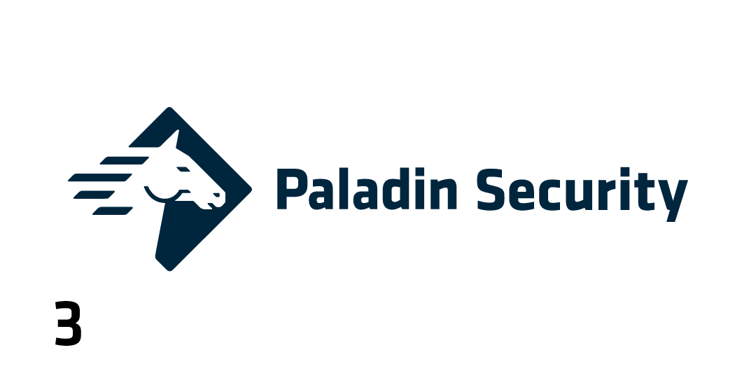
Primary Logo
Paladin's primary logo consists of our diamond horse logomark. It is followed by the 'Paladin Security' logotype, displayed in Klavika Bold.
Version 1 should be considered for use first, followed by 2 and 3 depending on contrast with the background.
Stacked Logo
If required by space, the logomark and logotype can be stacked vertically. This is also the preferred logo for partnerships.
Version 1 should be considered for use first, followed by 2 and 3 depending on contrast with the background.
Typography
Paladin type treatments are defined and styled for each usage, for both print and digital applications.
Display Type
I'm
Klavika
- the primary brand typeface.
Klavika is the primary brand typeface of Paladin. A straight-sided sans-serif with geometric influence, this typeface helps to communicate Paladin's professionalism, accountability, and innovative mindset.
Heading One
Heading Two
Heading Three
Heading Four
While primarily used for headings and display type, Klavika may be used for body text should it fit the design.
Klavika Regular:
ABCDEFGHIJKLNOPQRSTUVWXYZ
abcdefghijklnopqrstuvwxyz
1234567890
Klavika Regular Italic:
ABCDEFGHIJKLNOPQRSTUVWXYZ
abcdefghijklnopqrstuvwxyz
1234567890
Body Type
I'm
Montserrat
- the secondary brand typeface.
Montserrat is the secondary brand typeface. Inspired by old designs in Montserrat, Bueno Aires, this typeface enhances readability and scalability. The rounder curves and softer look contrasts well with Klavika's straight-sided edges.
Heading One
Heading Two
Heading Three
Heading Four
Montserrat is used mainly in body text such as paragraphs and lists.
Montserrat Regular:
ABCDEFGHIJKLNOPQRSTUVWXYZ
abcdefghijklnopqrstuvwxyz
1234567890
Montserrat Regular Italic:
ABCDEFGHIJKLNOPQRSTUVWXYZ
abcdefghijklnopqrstuvwxyz
1234567890
Photography
Great photography tells the Paladin story, convey the spirit of The Paladin Difference and compels our clients, customers and staff to take a closer look.
Subjects
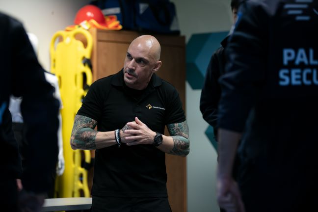
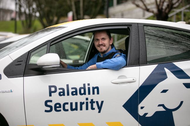
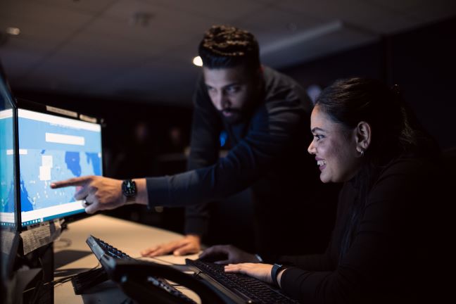
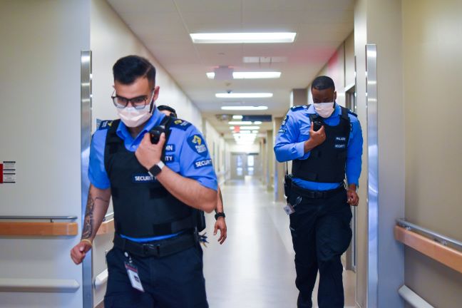
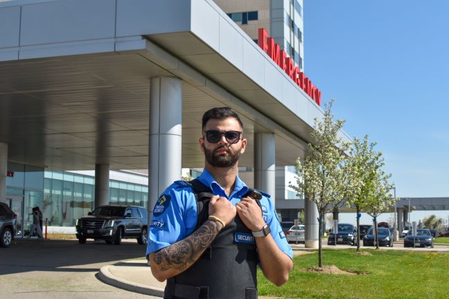
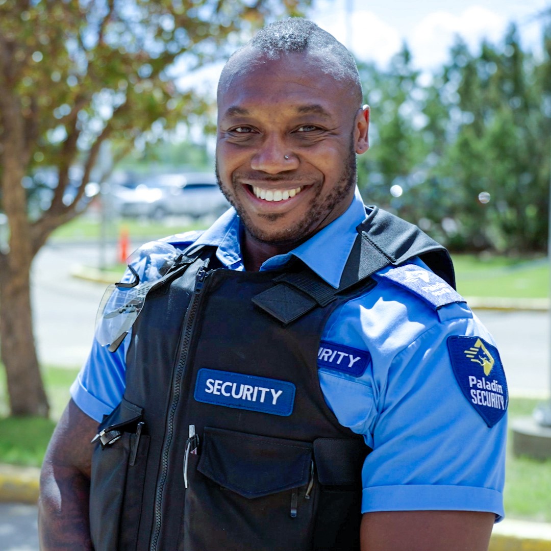
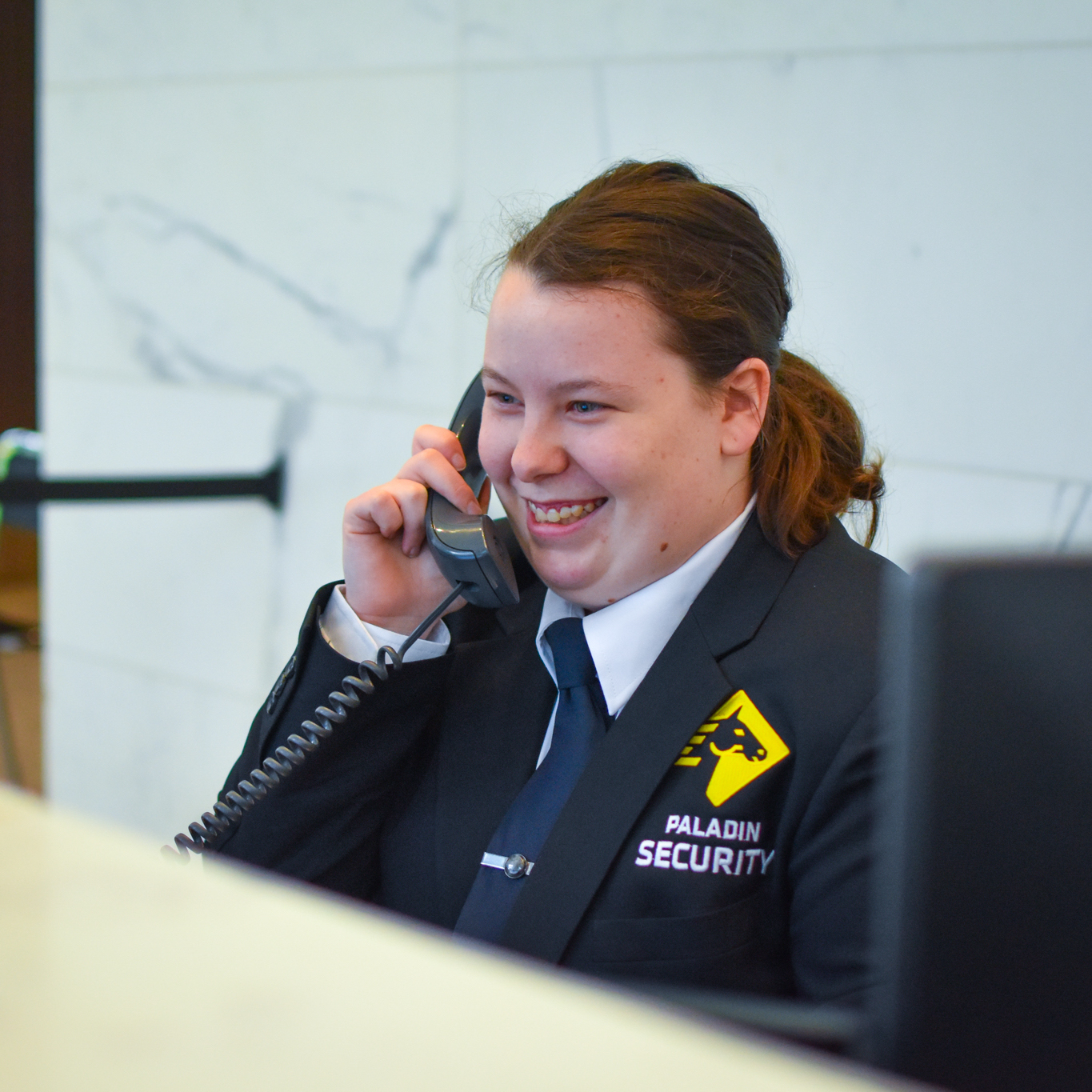
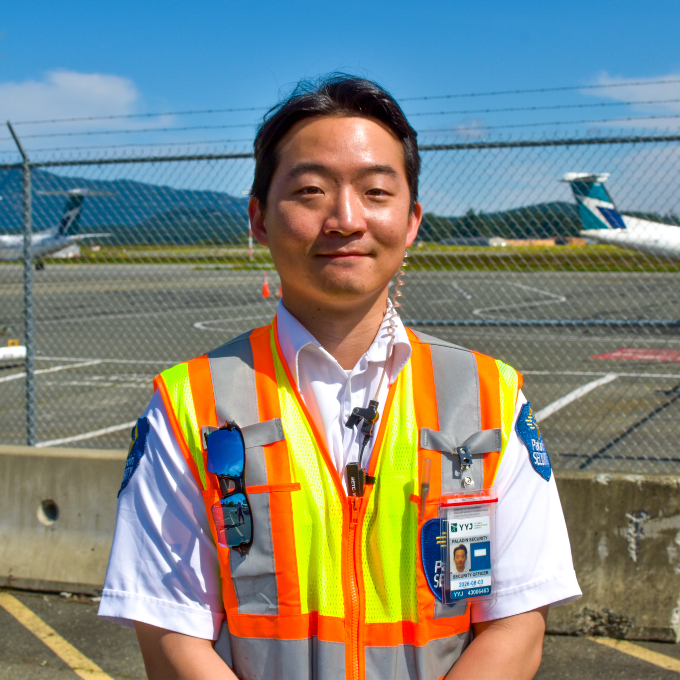
Photos should feature our people as the focus of the photo. Consider the framing and composition to highlight our people. Be sure to minimize distractions from the background and foreground where possible. Paladin branding should be visible, such as on officer uniforms or mobile patrol cars. Professional photography from the Marketing Team should be used as often as possible.

Brand Awareness
Paladin has a rich, living culture and our images need to reflect that as well as our diversity. Paladin has a history of innovation and interesting things continue to happen daily. We hope to convey, through our imagery, how we are embracing the future - while showing an understanding of the Paladin history.
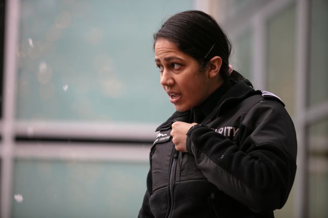
Avoid photos that may communicate an unfriendly brand image, such as photos featuring officers with sunglasses and crossed arms. Instead, use photos of officers smiling or friendly looking officers.


Interactive Elements
Interactive elements on Paladin webpages should be clearly identifiable. Active, hover, and focus states help to establish interactivity as well as maximize accessibility. Element styles may vary depending on the platform but styling should align with Paladin's brand colours and typography.
Buttons
Buttons are displayed as blocks with rounded corners. Text is centred horizontally and vertically. Hover and focus states should be clear and obvious. Below are some variations of button styles.
Button 1 Button 2 Button 3
                                .button {

                                    border-radius: 0.5rem;

                                    transition-property: background-colour;

                                    transition-duration: 0.2s;

                                    padding: 0.5rem 1rem;

                                    text-decoration: none;

                                    margin: 1rem 1rem 1rem 0;

                                    font-family: klavika-web, sans-serif;

                                    font-weight: 400;

                                    font-style: normal;

                                }


                                .button-1 {

                                    background-color: #ffc72a;

                                    color: #00263e;

                                }


                                .button-2 {

                                    background-color: #ffc72a;

                                    color:#00263e;

                                }


                                .button-3 {

                                    color: white;

                                    background-color: #00263e;

                                    transition-property: background-color, color;

                                }


                                .button-1:hover, .button-1:focus, .button-1:active {

                                    background-color: yellow;

                                }


                                .button-2:hover, .button-2:focus, .button-2:active {

                                    background-color: #29abe3;

                                }


                                .button-3:hover, .button-3:focus, .button-3:active {

                                    background-color: #29abe3;

                                    color: #00263e;

                                }
In-Text Links
Hyperlinks should be visually distinct from the containing text body. Text decoration such as coloured, bolded, or underlined text helps to establish interactivity in in-text links.
                            .intext-1 {

                                font-family: montserrat, sans-serif;

                                font-weight: 600;

                                font-style: normal;

                                color: #29abe3;

                                text-decoration: none;

                                transition-property: color;

                                transition-duration: 0.2s;

                            }


                            .intext-1:hover, .intext-1:focus {

                                color: #00263e;

                            }


                            .intext-2 {

                                font-family: montserrat, sans-serif;

                                font-weight: 600;

                                font-style: normal;

                                color: #00263e;

                                text-decoration: underline;

                                transition-property: color;

                                transition-duration: 0.2s;

                            }


                            .intext-2:hover, .intext-2:focus {

                                color: #ffc72a;

                            }
Image as a Link
When using images as a link, interactivity must be apparent and the text overlay should clearly describe the link's location. Images used should follow the photography guidelines.
Writing Style
Paladin's written communications follows specific guidelines for each publication type. Voice and tone will vary depending on if you are writing a blog, proposal, social media post, etc., so be sure to follow the specific guidelines for each one.
Below is a quickstart guide for our most common communications materials. For a complete guide on Paladin's writing style, please refer to the Canadian Writing Style Guide.
Newsletters, Social Media, and Blogs
For newsletters, CARE awards, social, and some blogs, write like you would talk. Write simply, using words you would use every day. As a best practice when writing for these purposes, keep writing to a grade 5 level in order for it to be easily consumed.
Avoid calling people by their last name only
Avoid using industry jargon. Instead, write it out and explain.
Use knowledgeable, approachable, friendly, and humble language for the tone of the brand.
Every blog should include a title, intro, and a 750–1000-word article with a few subtitles or bullet points throughout the text.
Press Releases
Press releases should be written in a professional tone and include need-to-know information. Keep in mind the five W's - who, what, where, why, and when. Include contact info at the bottom.
For additional support to ensure accuracy, use editing sites like Grammarly.
Proposals
For specific questions on writing proposals, reach out to the Proposal Writing Team and Technical Writing Specialist.
Customer should be centric for all proposed solutions. Writing should speak directly to the customer and address their challenges.
Default to formal, clear, writing throughout submissions and always remain professional in direct communication with customer contacts.
Verify usage of “Officer” / “Guard” dependent on region.
Avoid internal jargon (e.g. ERC, eHub, etc.) and write out the full name of an acronym in the first instance of using it.
Slogan
The company slogan is "Making the world a safer & friendlier place." This is our "tagline" or vision statement and can be used as such in promotional materials.
Display and Variation
Always write the slogan using the ampersand (&) rather than "and" spelled out.
Making the world a safer & friendlier place.
The slogan can also include a second line that reads "Because we CARE." CARE refers to Paladin's CARE values: Curious, Accountable, Respectful, Exceptional.
CARE should always be written in all capitals.
On designed materials, "Because We CARE" should start on a new line with centred text.
The slogan should be displayed in Klavika Regular.
Making the world a safer & friendlier place.
Because we CARE.
Letterheads
Paladin letterheads are consistent across all provinces. These are used in digital and printed text documents, both internally and externally.
Version 1
This letterhead is used for branch-specific communications such as contracts, letters, etc.
Header
The header consists of the Paladin Security logo aligned to the left and Canada's Best Managed Companies Platinum Member logo is aligned to the right. The background should be in Knight's Navy.
Footer
The footer contains the branch's office address, phone number, and the Paladin website, in Klavika Regular and all caps. These sections are separated by two yellow slashes.

Example
Version 2
This letterhead is used for general communications such as proposals and company-wide communications.
Header
The header consists of the Paladin Security logo on the left followed by a series of yellow slashes.

Footer
The footer simply contains the company slogan and website.

Example
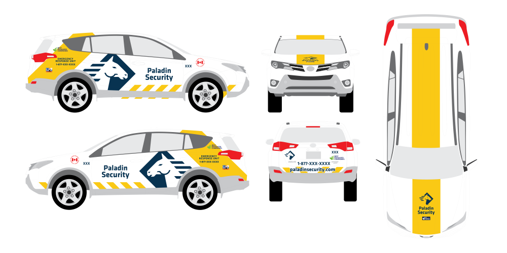
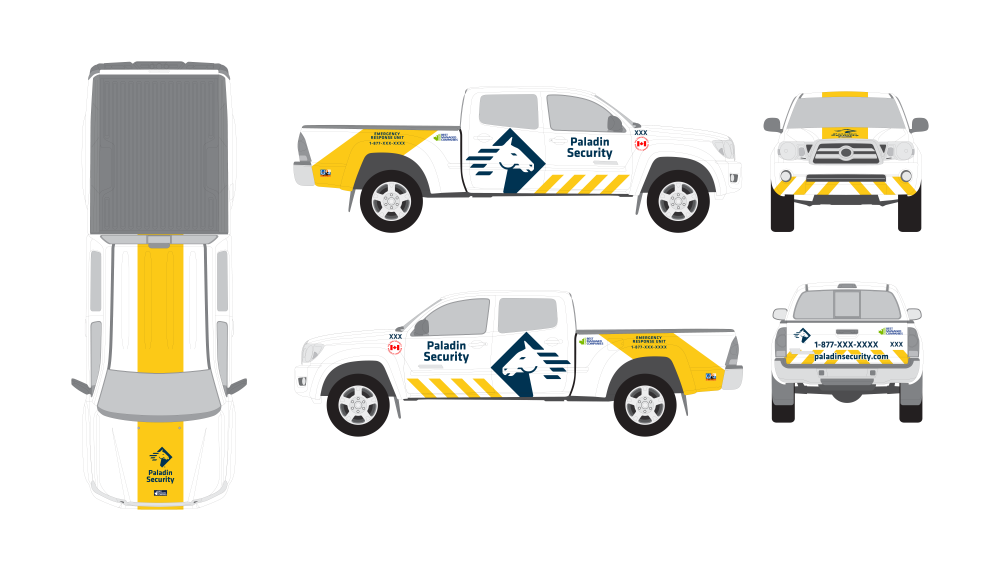
Vehicles
Brightly coloured, attractive vehicle wraps make our Paladin company vehicles stand out from all the other cars on the road and immediately recognizable. Paladin's vehicle wraps maintain a consistent design and are adjusted for each vehicle type.
Sedan
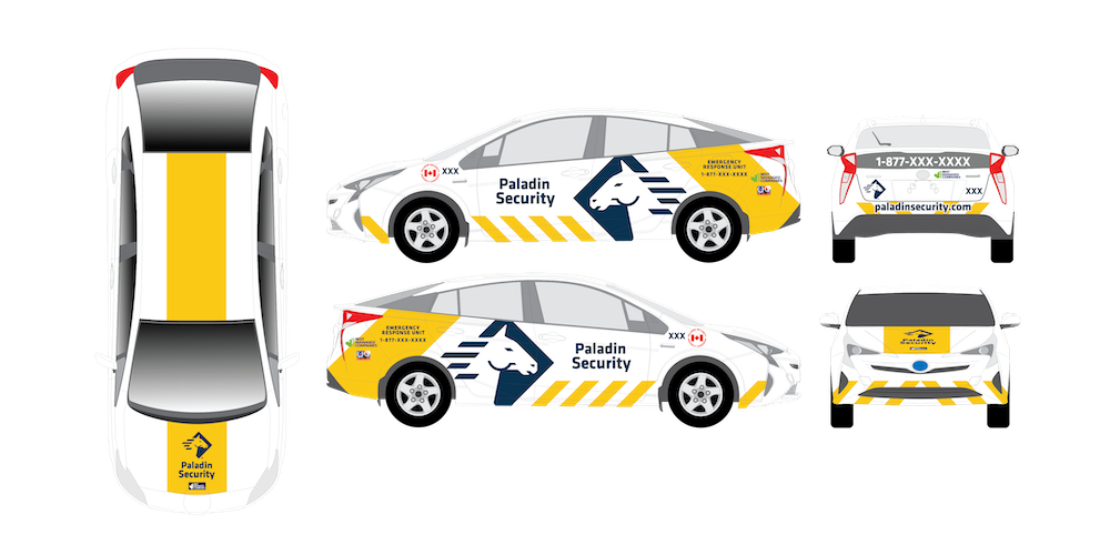
SUV
Truck
Office Branding
Paladin offices are branded consistently across the country to provide a welcoming and familiar atmosphere no matter which office you are in.
Logo
Placement
The Paladin Logo should be placed in the reception area and immediately visible when someone enters the space.
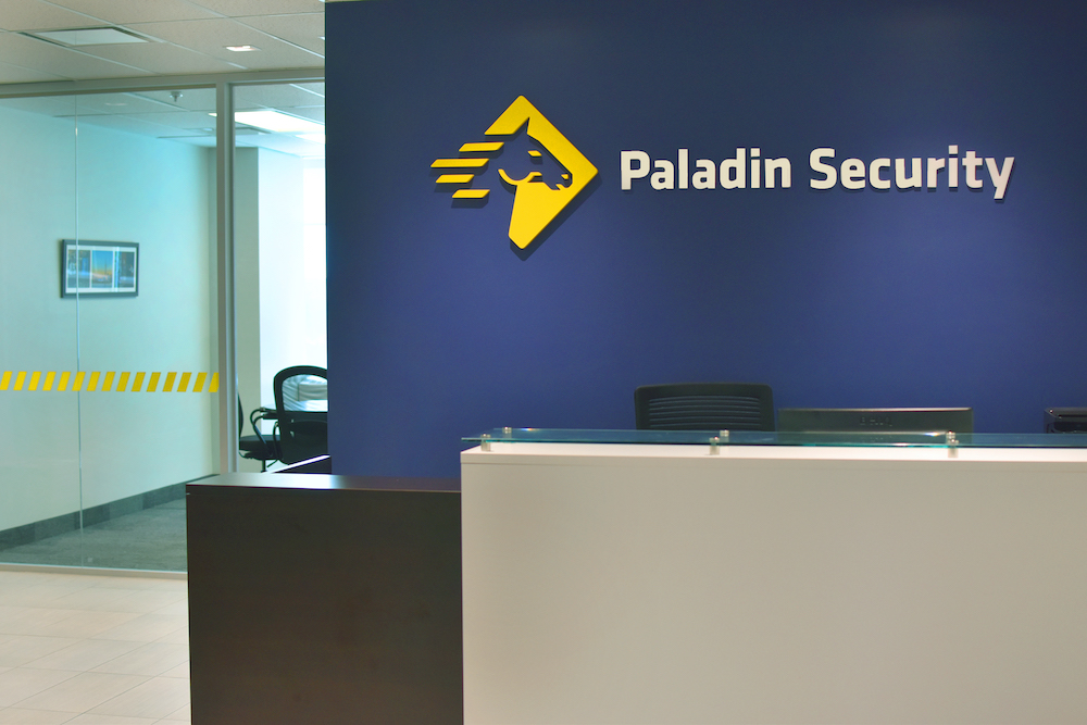
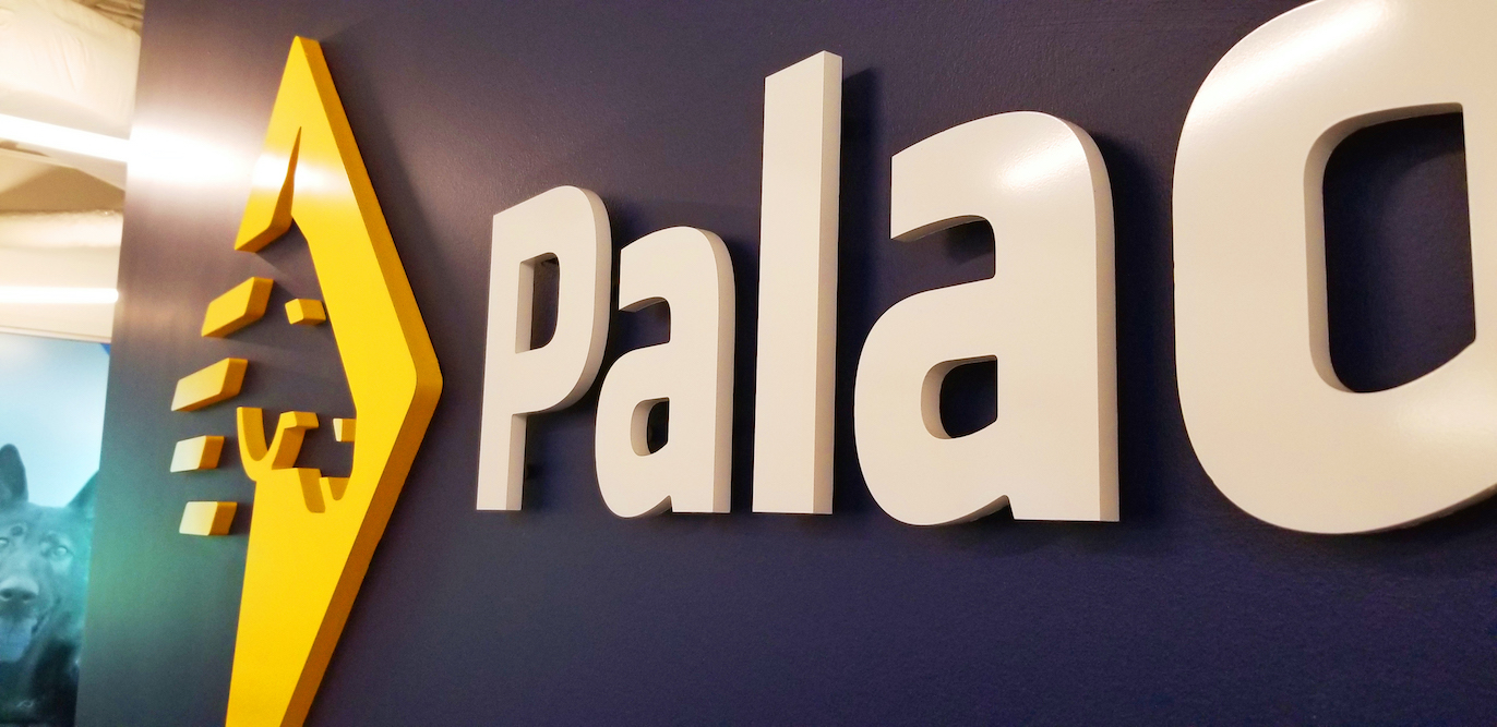
Materials
Logos should be 3D acrylic, laser cut for each letter. They must always be on a navy wall with the yellow logomark and white logotype. Glass can be added behind the logo if necessary, but should be transparent.
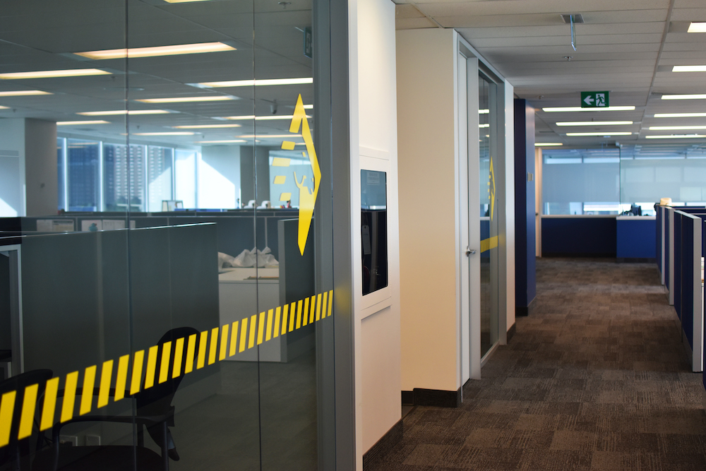
Office Decoration
Glass
The following are acceptable for decoration on glass:
Yellow slashes across the lower third of the glass (below eye level)
Frosted Paladin horse logomark
Frosted glass
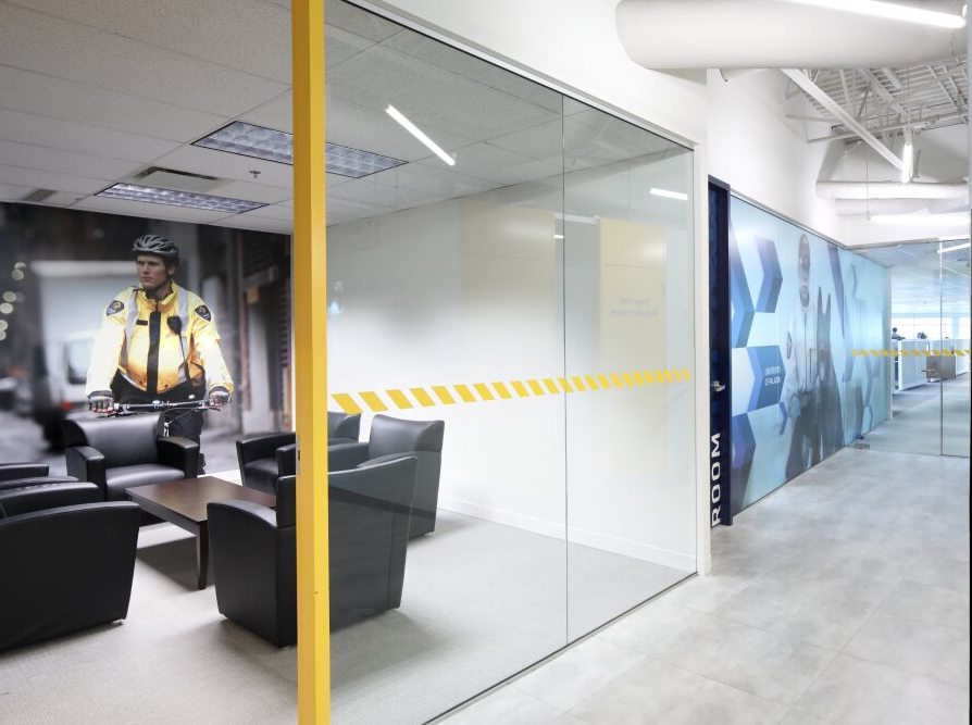
Paint
Office paint colours should be a mix of white, navy and yellow (as per the paint colours below). Navy and yellow walls should be ‘accent’ walls, that highlight the space or doors.
| Location | Colour Ref. # | Colour | Product Description | Product # | Formula/3.78L |
|---|---|---|---|---|---|
| White for all walls | P-1 | BM 2144-70 | HI-HIDE EGGSHELL | 55-020 | A-2 B-1 C-2 1-0.5 |
| Semi-gloss white for all doors and trim | P-1 | BM 2144-70 | HP2000 SEMI-GLOSS | 28-020 | A-2 B-1 C-2 1-0.5 |
| White for all walls | P-4 | BM 2137-60 | BREEZE INT FLAT | 55-010 | B-18 C-12 1-4 |
| Yellow for accent walls, doors, or trim | P-3 | PMS 123C | HP2000 EGGSHELL YELLOW BASE | 58-322 | SS-16 T-6Y |
| Blue for accent walls, door, or trim | P-2 | PMS 2965C | HP2000 EGGSHELL | 58-354 | B-IY18, D-12, E-9Y24, 22-28, KX-18 |
| Blue semi gloss for doors and trim | P-2 | PMS 2965C | HP2000 SEMIGLOSS | 58-254 | B-IY18, D-12, E-9Y24, SS-28, KX-18 |
If the paint options above are not available, use an alternative from Sherwin-Williams.
| Colour Name | Interior/Exterior | Line | Finish | Formula (One Gallon) | Base Tint | |||||||||||||||||||||||||
|---|---|---|---|---|---|---|---|---|---|---|---|---|---|---|---|---|---|---|---|---|---|---|---|---|---|---|---|---|---|---|
| Manual Off White | Interior | PROMAR 200 ZERO VOC | LOW SHEEN EG-SHEL |
|
EXTRA WHITE | |||||||||||||||||||||||||
| Match Blue | Interior | PROMAR 200 ZERO VOC | LOW SHEEN |
|
ULTRADEEP | |||||||||||||||||||||||||
| Match Yellow | Interior | PROMAR 200 ZERO VOC | LOW SHEEN |
|
DEEP |
Wall Murals
Wall murals can be placed in lobbies, meeting rooms, training rooms and high-traffic areas to promote our brand.
CARE Graphics
Security officer shots
Quotes
Arrows
University of Paladin
Horse logomark
Posters
Posters are an easy way to advertise new initiatives and showcase our culture. Posters should be kept up to date within the last five years. Posters can be placed around working areas (e.g. cubicles, desks, etc.), kitchen/break areas, and the lobby.
Examples of posters:
Making the World a Safer & Friendlier Place
Newspaper Articles
4 Seasons of CARE photos (e.g. cheque presentations, group, photos, etc.)
4 Seasons of CARE Posters
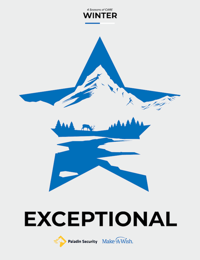
Landmark Office Posters
Awards
We are proud of our many awards and distinctions. Whenever possible, showcase awards or certificates in lobby areas and in frames or cases whenever possible.
Furniture
Furniture in Paladin Group offices should be modern, inviting, and functional. Opt for black and white colours for chairs, desks, and tables whenever possible, and use navy or yellow as accent colours where applicable (e.g. pillows, side tables, pots, etc.). Higher quality fabrics such as leather for chairs, or durable cloth should be used for high traffic seating areas (e.g. lobby or meeting rooms).